The Bodleian Library and Shakespeare
The Bodleian Library and Shakespeare
Earlier this year the Bodleian Libraries’ Centre for the Study of the Book announced its ‘Sonnets 2016’ project to commemorate the 400th year since the death of Shakespeare.
Printers across the world were invited to take part by reproducing one of Shakespeare’s 154 Sonnets. Those who responded early got their pick first, with most of the more famous and recognisable ones getting snapped up quickly. Within a very short space of time all the Sonnets were assigned and we were fortunate to get Sonnet 48 (not one I was familiar with but one I have since got to know rather well).
The brief was very open, a lot less prescribed than some collaborative print shows I have taken part in. All that was required was that the process must be a form of relief printing, with the paper size and edition left down to the printer’s discretion. My initial thought was ‘this is going to be easy’, but I was to discover that sometimes having a wide open brief can leave you staring blankly at a clean sheet of paper.
The more I thought about this, the greater the expectation I had for the print. After all, this is a unique opportunity to contribute, in however small a way, to Shakespeare’s legacy. This print is going into the Bodleian Libraries forever, so this has to be something special.
2016 has been a busy year for Smallprint Co. Mainly because we moved our studio and set up a small gallery/shop, together with doing the day-to-day business. The summer galloped by and very soon a warm September was racing towards me. The deadline for the Sonnets 2016 was the 30th, so with this in mind, it was time to sharpen up the pencil and get the final sketches together.
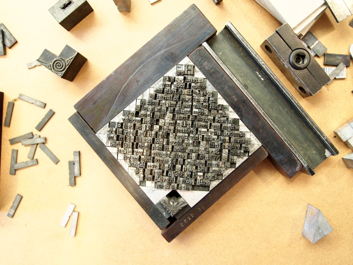
Choosing a typeface was the first decision, though in the end I opted for one which I often default to. It’s a beautiful ‘old style’ and it has the advantage of being a substantial full font with little risk of getting ‘out of sorts’. This was one of my unlabeled cases that I acquired a couple of years ago, and through a degree of detective work I have identified as ‘Jenson’ 12pt, a foundry typeface by Stephenson Blake and based on William Morris’ Golden Type.
Reading over the sonnet I tried to get some inspiration for the form. Shakespeare makes reference to keeping love locked in a chest and this led me to develop an idea around a box shape form for the text. I didn’t want it to be too literal and began with setting the type fully justified in the centre of the sheet. I didn’t think that it lent itself enough to the ‘box’ idea, but then thought about spinning round to form a neat diamond. This of course raised more challenges in calculating the increasing and decreasing line widths, making sure to avoid too many hyphens and rivers. Several adjustments were made over a couple of days as it always helps to walk away from a job and look again with fresh eyes. It seemed that each time a line was altered the changes cascaded down the text making more adjustments necessary, a river would form or a line would look ragged or too condensed.
The final print was produced in an edition of 20 on Somerset cotton paper, with one copy submitted to the Bodleian Library and the remainder available to purchase. In the end it was a pleasure to work on and gave me the chance to try some new tricks and experiment with structure. I hope you enjoy the final print.
Christopher Barker
Printer
If you are interested in owning a copy, details can be found here.
You can follow The Bodleian’s blog on all the sonnets received from around the world here